So you think that it’s important to include the link “view in your browser” in your email campaign?
Think again!
Comparing the technical capabilities of email versus the technical capabilities of WebBrowser is similar to comparing a bicycle to an automobile.
Sure, both methods will lead you to your destination but the effort needed to arrive there by bicycle will dissuade most people.
The goal of an effective email marketing campaign is to lead a user to the intended conversion area in the fastest and most direct way possible.
Has my targeted recipient read the content of my email? This question remains secondary. The main goal is that the recipient clicks one of the links included in the message!
“Why?” you might ask.
Just like the automobile, WebBrowser is comfortable, spacious, fast, and has many attributes that a bicycle simply cannot offer.
When using WebBrowser, the marketing designer has access to a technical environment that enables the person to create a captivating visual experience for the visitors. Thanks to HTML5, CSS, and JavaScript, the designer can install dynamic action catalysts, work on design while factoring in the site’s ergonomics, bring images to life, etc.
On the other hand, email design is very static. No HTML5, no CSS, images are not automatically shown, no forms, videos, etc. Granted, the iPhone, Apple Mail and android based on WebKit are all very flexible and allow greater possibilities in design, the downside is that many intended recipients will open their messages with - you guessed it - many versions of MS Outlook. Unfortunately, this constraint forces the email designer to comply with uniformity thus sacrificing quality.
The industry’s natural reflex, to counter this constraint, is to offer an automatic link that will allow it to open in a web browser.
If my intended recipient was unable to see my visually stunning email marketing montage, I can always provide a link that will lead the person to see my masterpiece on my website. They will see for themselves just how beautiful my design truly is!
Offering a link makes sense in the context of a newsletter where the relevant information resides in the body of the message, and that there would be no other reason for the reader to visit the website.
When email marketing’s purpose is to draw recipients to browse the website subsequently leading to product purchase, this link becomes absolutely unnecessary. It only adds another element of visual distortion in the message.
Clearly, you don’t need to remove the link. However, you must use it wisely.
Why display the same static email content once again? When the conversion rate potential is low and your visitor has already been redirected to the website?
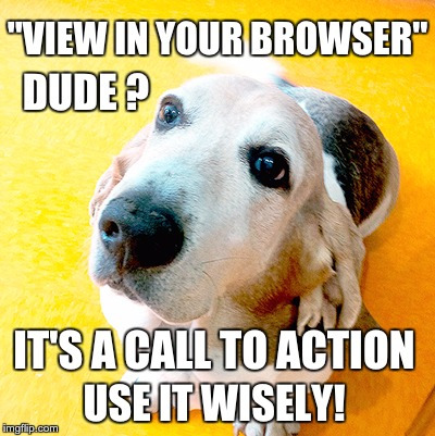
The “View in browser” link is a call-to-action that carries the same weight as “Order Today!” or “Get your 50% off coupon”. While you already do have your reader clicking on the message you might as well bring that person to the page most likely to engage the reader.
Time is precious - especially so for subscribers reading your email. In a blink of an eye, they must be able to find the information relevant to them. Prompting the reader to scroll to the bottom of your email to read the rest of the message requires an added effort. Not necessarily tempting when he is subjected to over one hundred messages on a daily basis.
Therefore, it becomes very important to minimize the space used for identification purposes. We receive way too many promotional emails that have more than 300px in height devoted to identity (logo, menu bar, social media, etc.).
A thorough analysis of HeatMap, available through eFlyerMaker, will make you realize just how much space is wasted and that it generates so few clicks with every passing email marketing campaign.
A preheader ?
But of course! Adding a preheader before your “View in browser” link enables you to publish an introductory text in your message’s listing.
Why not both?
No, I want all three cases
All three?
- Directly at the start of the message, post a link leading to the best section of the website just in case my message cannot easily be read by the recipient.
- A catchy phrase summarizing the message’s content and inviting the visitor to read the remaining content online.
- The same sentence used as a preheader.
“View our Lookbook online, click here“ instead of “Can’t see images? click here”
“Don’t worry the action is online” instead of “Can’t view this email ?”
“This message is just an overview of all our best offers. view all“ instead of “This message contains graphics. If you do not see the images, click here“
This method will help maintain an enjoyable reading experience, and lead to fewer lost clicks than when the message is shown twice.
More
Jen Capstraw’s blog entry took the idea of lost email space one step further by factoring in mobile phones.
Not only does a strategy have to limit message length and reduce the number of links per email marketing campaign, but it is imperative to choose targeted content for each user. Obviously, we’re not talking about writing and preparing a new campaign for every subscriber. Segmentation does enable us to cluster interest groups but it has its limits. Thus a useful tool such as the excellent Matcher Analytics which uses Machine Learning and Predictive Algorithms becomes essential for email marketing campaigns in ecommerce.
